On Tuesday, Norwich City unveiled their new updated club crest to the world and significant changes always tend to split a club’s fanbase. It is impossible to win over every single supporter when it comes to club changes and from reading the Twitter replies to Norwich’s announcement, there are clearly those that like the new crest and there are other people wishing for the clock to go back.
However, Canaries fans should count themselves lucky because there have been plenty of other clubs over the years that have made seismic changes for the worse. Here are some of the standout crest changes - both good and bad - from over the years.
Inter Milan
The famed Italian side made a dramatic change to their logo to mark their 113th birthday earlier this year. The Nerazzurri abandoned the gold that was a unique part of their crest, and they removed their gold star which highlighted their solitary European title. The change did not go down well with fans, and it didn’t go down well among the wider football community either.
Juventus
It was not the only stinker to come out of Italy in recent years as the Old Lady abandoned tradition and class of their oval crest for a giant ‘J’ which perfectly summed up the direction modern football was heading when they made the change in 2017. Gone was the Scudetto shield and crown that was the bottom of the old crest, and no such intricate details were added to its successor. In fairness it was a smart design, but it looks so bland and doesn’t represent any history for one of Italy’s greatest clubs. Another unpopular switch.
Cardiff City
Who can forget the dramatic change the Welsh side went under in 2012 under Malaysian chairman Vincent Tan? Not only was the Bluebirds’ badge changed, removing the bluebird as the key component, and moving it down to the bottom, but a large red dragon took the dominating spot on the badge as the club transformed from a blue to a red side. The club reverted to tradition three years later after continuous fan pressure, but Tan ensured a small dragon remained on the more traditional badge, where it has stayed ever since.


West Ham United
There has been plenty of change for the east London club in recent years. The football may be amazing to watch right now, but it’s covering the cracks of losing the historic Boleyn Ground and to mark the new era at their new home, London Stadium, supporters wished for a more modern crest – something they probably regret. The more decorative previous crest which contained the Boleyn Ground was wiped and just the two sledgehammers remained with ‘London’ written underneath, giving it a very basic look.
Leeds United
The internet blew up in 2019 when the Yorkshire outfit revealed the design they planned to use as their new crest and Leeds fans were outraged, while the rest of the football community ridiculed them. There was no subtle change either. The traditional crest was abandoned and swapped for what can only be described as a clip art design or something that you would see on a dodgy football game. It didn’t take long for the design to get shelved, but luckily the internet will never forget this monstrosity.
Everton
One that tends to slip under the radar if you’re not a Toffees fan. The Merseyside outfit announced they were changing their crest in 2013 and they dropped the club’s mantra “Nil Satis Nisi Optimum and the shade of blue changed. Fans were not happy and following their growing pressure, the missing details were brought back.
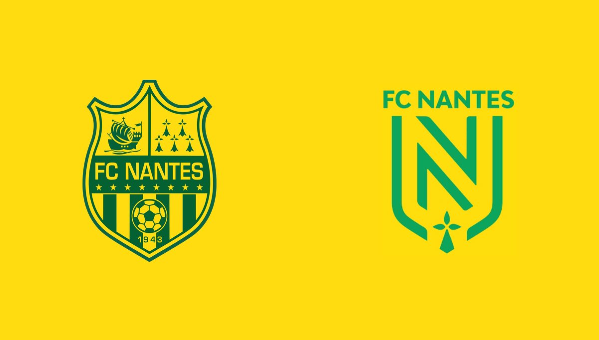
Nantes
This French club changed their badge in 2019 and similarly to Juventus, all the unique details of their previous crest were cleared for a more modern look. They crested a large outline that looked like a ‘U’ and inside were lines to outline an ‘N’ with ‘FC Nantes’ written above it. It has a bit more about it than Juve’s, but once again club history is just seemingly abandoned.
However, there have also been some positive responses to branding changes over the years.

It's always difficult to say goodbye to a classic crest, but if you're going to move on you might as well do it like this. 👏🏽👏🏽
Manchester City
Manchester City made their change in 2016 and took inspiration from the one they used between 1972-1997 and the supporters were on board with the change. The golden eagle was cast aside and the club’s founding year, 1894, and the Lancashire red rose took pride of place. One of the rare cases in modern football that a new badge was popular.
Bristol City
It was only two years ago that Bristol City decided to freshen up their look and it was a smooth transition, and a definite upgrade. A robin was centred in their new circular crest with the founding year, 1894, next to it. A similar design to Manchester City’s, simple but effective.